Friday 31 January 2014

Multi-Media Graphic Image Making Techniques

To get into drawing the shape of a fortune cookie, which I'm planning to use heavily in my brand identity, I sketched out some variations before moving onto using different materials in my experimentation...


Polka Dot Fortune Cookie

Tea-Stained Paper Collage Fortune Cookie

Glitter Glue Fortune Cookie

Watercolour Rainbow Fortune Cookie

Ink Stamped Fortune Cookie

Watercolour Fortune Cookie

Straight-Edged Watercolour Fortune Cookie

Glitter Fortune Cookie

Black Textured Images Collage Fortune Cookie

Type Experimentation


I first drew out this Chinese lettering inspired typeface. I wanted it to be in the regular alphabet but have characteristics like the Chinese letter forms. I then developed this idea with watercolours. I like this as it means a wider audience base can understand the brand's identity but it retains the Shanghai connection.


I also tried a simple script type using watercolours to see a variation of what my logo could be.


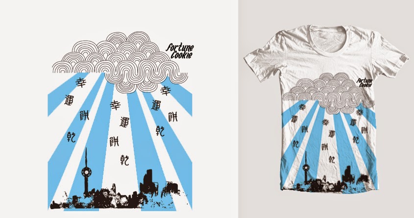
As my brand identity is all about it's link to Shanghai, China it makes sense to have a variation of the logo in the Chinese language. It not only gives the brand culture but it can also look very beautiful and would catch peoples eye, particularly because it's not seen very often in clothing.
There I used the pro marker pens which gave a bold and vibrant look.

Here I drew the outlines for the lettering which I then used to take it onto Photoshop to develop it further. Finally, I live traced it and rendered it onto Adobe Illustrator.

I then painted this version using a black ink as that is the material used for the traditional method of writing Chinese lettering. I do like this effect and maybe with a few more attempts it could look neater and more professional but I feel for my brand identity I would like a bolder logo like the attempt above.

Red Watercolour Chinese Lettering

Green & Blue Overlay Watercolour Chinese Lettering

Use of negative space. I cut the shape of the lettering out of the white paper and layered it over some patterned paper. This created a different effect as the writing wasn't in a solid colour as it had a texture. It is a little messy but I think the more ways I experiment with different materials the closer I am to finding the ones that I would like to make up my brand identity.

In my research I saw a lot of large patterns and this spot pattern felt trendy to a wide population as well as fitting with the Shanghai culture the brand has. I like the different colours that break up the writing as it looks three dimensional and a lot more funky than the more bland and basic logos you see on most clothing. However, this may mean that the wider audience prefer a more toned down look - It does contain some elements of a gradient/tie-dye which is in fashion at the moment on the other hand.

Wednesday 29 January 2014

Screen Development of Logos

I tried out a few more techniques and styles that are more close to the direction I'm aiming for.


I made the Chinese version of my clothing brand logo out of wool - it looks quite quirky but I don't think I can use something like this in my branding. 
As I want my clothing brand to be recognisable worldwide I tried some ideas for the english translation... I tried out some different type styles to see what could work for my branding. 


Screen Development of Logos


Here is one variant of my logo. I think this design would look really funky on a t-shirt or bag. It can also make an interesting pattern when put together...


Using this pattern, I have made another variant to my logo I put it inside the fortune cookie shape...

I also masked the pattern into a typeface that had an oriental style to it...


These variants will need a little more work to them to make them look more professional and finished but here are some alternative logos to use across my branding...


Here is the main logo that I'm planning on using as my brand identity...
I think it works as it reminds me of Chinese takeaway boxes and the oriental graphic design style I have been looking at.


Sunday 26 January 2014

Friday 24 January 2014

Stationery Final

I have already research and looked at some stationery but as it is the next step in the unit I looked in more detail as to the direction I wanted my stationery to go in...


Here was my first attempt - I have gone for a centred letterhead as it looks organised, uniform and therefore professional. However, I think it's a little too intense for the letterhead so I went with this...

Letter head - 

I think the letterhead works well as it leaves plenty of white space to write the letter content without being disrupted by brightly coloured design or bold shape. I had thought about putting in a watermark in this space but I didn't have a shape or logo element that would work well enough to warrant it being there. I added the alternate logo to add further to the design features and to provide some colour that I continued into the contact details. I think it looks clear, professional and provides the identity of the brand. I think I would have liked a more equal looking bottom as the logo in one corner could look a little untidy to some people.

Compliment Slip - 

This sticks to the house style and format of the letterhead continuing the professional and clear look of my stationery.

Business Card (Front) - 

I wanted to have the front of my business card be very different to conventional business cards as it is a pattern rather than the word logo. It still continues the use of the alternate logo in my stationery as well as giving it that vibrant look that my clothing brand brings as a company.

Business Card (Back) - 

Again the format is continued in terms of the alignment, fonts, colour scheme and content idea.

Final Stationery mounted and presented together


Thursday 23 January 2014

Tags Final

Front -

Here are the fronts of my 5 various swing clothing tags. Each one is quite different to reflect the product it would be attached to.
The first is a long rectangular tag features the main logo.
The second is a circular tag that has the spotted Chinese writing pattern and main logo.
The third is a rectangular tag with cut edges and has one of the blue spotted pattern type logo.
The fourth is a rectangular tag with a circular attachment loop and has the company name in the type used for the stationery and occasionally on the clothing designs.
The fifth logo is a tribute to the red money envelopes that Chinese people exchange on new year. It has the company logo on written in Chinese writing.


Back -

Each logo also has a handmade felt fortune cookie attached with a message inside.

Wednesday 22 January 2014

Clothing Design Development

Here is the development for one of my clothing designs. I built up this flower motif with hand drawn and vector elements. I tried out a few colour schemes but I liked the black and white the best.

I put the flower motif on a t-shirt as it is a strong visual that I think my target market would like.

I then duplicated the motif to create a pattern and masked it onto a notebook and added my logo.

Finally, I used the motif as my wall art. I think my target audience would like this visual on their wall because it is very eye-catching, fun and quite unique to what you would usually have on your wall.


Next is my Shanghai city scape. I made a stencil and painted a rainbow effect into it. I then tried out some different techniques on photoshop and made this distressed black version. I also made this scene that combines some different Chinese/Shanghai features and elements I merged together.

Here is the rainbow Shanghai city scape I placed on a t-shirt. I think my female target market would really like this one as it is fun and quirky and also pays homage to the city where the company is based.

Here is the distressed black version on a t-shirt. I think my male target market will like this more than the white one as it is quite grungey which they may like.

I also put the design on to a sweatshirt which some of my customers may prefer to the t-shirt - especially in winter months.

Finally, here is the merged design on a laptop case. This design will be exclusively on the lap top case as it is quite different to the other clothing and accessory designs. I like it as it shows the culture and landscape of Shanghai in a style that I hope would appeal to a wider audience then just Shanghai.

This is a logo I made to be used on my accessory designs after seeing lots of t-shirts with clothing logos like the one in the picture. I really like it as it is fun and energetic and it reminds me a lot of the chinese graphics I saw a lot in my research.

 I put the design onto these rucksacks. I think younger ages of my target market would like these for school as they are in bright colours which are fun for school. I think that most of my target market would like them however, as they are bold, quirky and funky which I profiled my customers as.

I then put the design onto tote bags which are very popular at the moment.

I put them on baby grows for boys and girls so that I can reach a wider market and also give people who like the brand clothing to put their children in.

A pencil case. I like this as the logo covers the space well and it is quite large which could grab others attention (increase brand awareness)

Hoodie - As the colour of the hoodie is quite bold I decided to make the logo a small motif on the breast which will be more discrete.

This is just an idea but I thought I could put my customers purchases in this Chinese food box as it is quite a quirky, fun way of reinforcing the theme of the brand.

Here is the iPhone case using my red spotted chinese writing pattern. I think it works well on an iPhone case as it is bold and eye-catching which I think most of my target market would like on their case.


Here I have just put my main logo on a t-shirt. It is a more simple design that some of my more reserved target market may prefer.

Here is the development of my final design which has combined the distressed black city scape, flower motif and some new elements to create this rain over Shanghai scene.

When putting the design onto the t-shirt I decided to stretch the design to cover he bottom of the t-shirt as it makes it look more like a image and gives a bigger impact than before.

I also put the design onto an iPhone case - I had to make the design a little longer to look in proportion on the case.