Here is the development for one of my clothing designs. I built up this flower motif with hand drawn and vector elements. I tried out a few colour schemes but I liked the black and white the best.
I put the flower motif on a t-shirt as it is a strong visual that I think my target market would like.
I then duplicated the motif to create a pattern and masked it onto a notebook and added my logo.
Finally, I used the motif as my wall art. I think my target audience would like this visual on their wall because it is very eye-catching, fun and quite unique to what you would usually have on your wall.
Next is my Shanghai city scape. I made a stencil and painted a rainbow effect into it. I then tried out some different techniques on photoshop and made this distressed black version. I also made this scene that combines some different Chinese/Shanghai features and elements I merged together.
Here is the rainbow Shanghai city scape I placed on a t-shirt. I think my female target market would really like this one as it is fun and quirky and also pays homage to the city where the company is based.
Here is the distressed black version on a t-shirt. I think my male target market will like this more than the white one as it is quite grungey which they may like.
I also put the design on to a sweatshirt which some of my customers may prefer to the t-shirt - especially in winter months.
Finally, here is the merged design on a laptop case. This design will be exclusively on the lap top case as it is quite different to the other clothing and accessory designs. I like it as it shows the culture and landscape of Shanghai in a style that I hope would appeal to a wider audience then just Shanghai.
This is a logo I made to be used on my accessory designs after seeing lots of t-shirts with clothing logos like the one in the picture. I really like it as it is fun and energetic and it reminds me a lot of the chinese graphics I saw a lot in my research.
I put the design onto these rucksacks. I think younger ages of my target market would like these for school as they are in bright colours which are fun for school. I think that most of my target market would like them however, as they are bold, quirky and funky which I profiled my customers as.
I then put the design onto tote bags which are very popular at the moment.
I put them on baby grows for boys and girls so that I can reach a wider market and also give people who like the brand clothing to put their children in.
A pencil case. I like this as the logo covers the space well and it is quite large which could grab others attention (increase brand awareness)
Hoodie - As the colour of the hoodie is quite bold I decided to make the logo a small motif on the breast which will be more discrete.
This is just an idea but I thought I could put my customers purchases in this Chinese food box as it is quite a quirky, fun way of reinforcing the theme of the brand.
Here is the iPhone case using my red spotted chinese writing pattern. I think it works well on an iPhone case as it is bold and eye-catching which I think most of my target market would like on their case.
Here I have just put my main logo on a t-shirt. It is a more simple design that some of my more reserved target market may prefer.
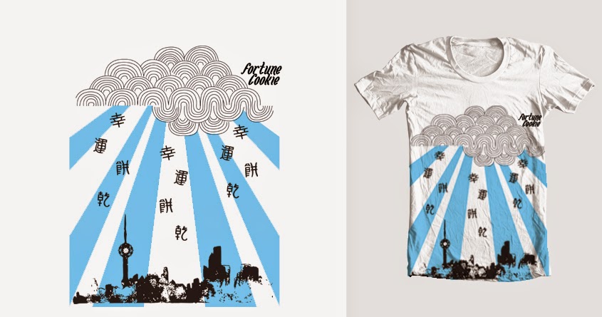
Here is the development of my final design which has combined the distressed black city scape, flower motif and some new elements to create this rain over Shanghai scene.
When putting the design onto the t-shirt I decided to stretch the design to cover he bottom of the t-shirt as it makes it look more like a image and gives a bigger impact than before.
I also put the design onto an iPhone case - I had to make the design a little longer to look in proportion on the case.